name: Visualizing Data class: right, top, inverse background-image: url(images/01_VisualizingData.jpg) background-size: cover # Neighborhood Analysis .font-35[Session 5: Visualizing Data] ??? --- name: Why Visualization? class: right, middle # Why do we visualize our data? --- name: DuBois class: left, top background-image: url(images/02_DuBois_1.png) background-size: contain --- class: left, middle .pull-left[  ] .pull-right[ “I got a couple of my best students and put a series of facts into charts: the size and growth of the Negro American group; its division by age and sex; its distribution, education and occupations; its books and periodicals. We made a most interesting set of drawings, limned on pasteboard cards about a yard square and mounted on a number of moveable standards. The details of finishing these 50 or more charts, in colors, with accuracy, was terribly difficult with little money, limited time and not much encouragement.” ] --- class: left, middle .pull-left[  ] .pull-right[  ] --- class: left, middle .pull-left[  ] .pull-right[ ### How do craft visualizations that tell a story today? ] --- class: left, middle .pull-left[.font-35[ <br>  <br><br> In this week's labs you'll start to learn the *grammar of graphics* in GGplot] ] --- class: left, middle .pull-left[.font-35[ <br>  <br><br> In this week's labs you'll start to learn the *grammar of graphics* in GGplot] ] .pull-right[  <br> <span style='color: #FDC87A;'>Data:</span> Your source data <span style='color: #50A781;'>Aesthetics:</span> What variables are visualized and how <span style='color: #568DC1;'>Geometry:</span> The specific plot type we would like to make <span style='color: #946EB2;'>Facets:</span> Facets allow us to create small multiples <span style='color: #D6656A;'>Statistics:</span> summaries of data distribution <span style='color: #C3A385;'>Coordinates:</span> Coordinate system for the plot <span style='color: #FDC87A;'>Themes:</span> Collections of plot styles and options ] --- class: left, top # Basic template - ggplot: "Initialize" a map object (data frame, aesthetics, columns...) - geom: add layers (use the ** + ** operator) - The **+** sign used to add new layers must be placed at the end of the line ```r ggplot(data = <DATA>, mapping = aes(<MAPPINGS>)) + <GEOM_FUNCTION>() ``` --- # Aesthetics ```r ggplpt(data = <DATA>, mapping = aes(<mappings)) + <GEOM_FUNCTION>() ``` Item | Description ---------| ------------- x | Position on x-axis y | Position on y-axis shape | Shape color | Color of border of elements fill | Color of inside of elements (changes the color of the graph by group/facor) size | Size alpha | Transparency (1: opaque; 0: transparent) line type | Type of line (e.g., solid, dashed) --- class: left, top # Geometries ```r ggplpt(data = <DATA>, mapping = aes(<mappings)) + <GEOM_FUNCTION>() ``` Item | Description ---------| ------------- geom_point | Scatter plots, dot plots, etc. geom_boxplot | Boxplots geom_line | Trend lines, time series, etc. geom_path |Connects the observations in the order in which they appear in the data geom_histogram | Visualise the distribution of a single continuous variable geom_hline | Add horizontal reference lines geom_vline | Add vertical reference lines geom_smooth | Add a smoothing line in order to see what the trends look like geom_sf| Visualize simple feature (sf) objects(maps) --- name: pause for covid class: top, left # A Tweet sparks a question... .pull-left[ <img src="images/CDPH_Tweet.png" width="83%" /> ] .pull-right[ .font-35[ Sorry to bring COVID into this... What demographic factors help to explain the difference between where people are dying and where vaccinations are occurring? ] ] --- name: Get Data class: top, left <img src="images/chi_portal_covid.png" width="100%" /> --- name: Get Data 2 class: top, left <img src="images/chi_portal_covid_2.png" width="100%" /> --- name: Get Data 3 class: top, left <img src="images/chi_portal_covid_3.png" width="100%" /> --- name: Scatterplot COVID Infection Rate class: top, left .font-35[What's the relationship between COVID *cases* and vaccinations?] .pull-left[ .panelset[ .panel[.panel-name[Output] 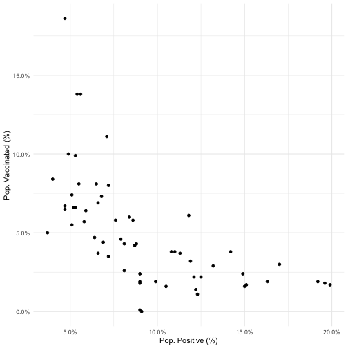<!-- --> ] .panel[.panel-name[Code] ```r ggplot(dataset %>% filter(percent_tested_positive_cumulative !=0)) + geom_point(aes(x=percent_tested_positive_cumulative, y=X_1st_dose_percent_population))+ labs(x="Pop. Positive (%)", y="Pop. Vaccinated (%)")+ scale_x_continuous(labels=scales::percent)+ scale_y_continuous(labels=scales::percent)+ theme_minimal() ``` ] ] ] .pull-right[ How would you describe this in your own words? - What does each point represent? - Are the scales for X and Y reasonable? What do they tell you? - Is there a particular region on this plot that might spark questions for further exploration? - Are you ready to write an op-ed for the Chicago Tribune or Sun Times (the two major newspapers)? ] --- name: Scatterplot death rate class: top, left .font-35[What's the relationship between COVID *deaths* and vaccinations?] .pull-left[ .panelset[ .panel[.panel-name[Output] 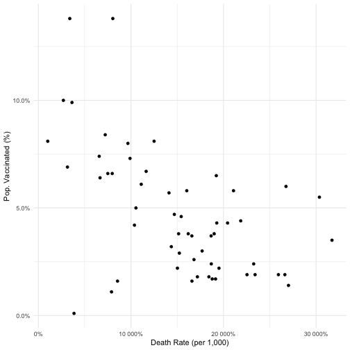<!-- --> ] .panel[.panel-name[Code] ```r ggplot(dataset %>% filter(percent_tested_positive_cumulative !=0)) + geom_point(aes(x=death_rate_cumulative, y=X_1st_dose_percent_population))+ labs(x="Death Rate (per 1,000)", y="Pop. Vaccinated (%)")+ scale_x_continuous(labels=scales::percent)+ scale_y_continuous(labels=scales::percent)+ theme_minimal() ``` ] ] ] .pull-right[ How would you describe this in your own words? - What does each point represent? - Are the scales for X and Y reasonable? What do they tell you? - Is there a particular region on this plot that might spark questions for further exploration? - Are you ready to write an op-ed for the Chicago Tribune or Sun Times (the two major newspapers)? ] --- name: Maps class: top, left .pull-left[ .panelset[ .panel[.panel-name[Output] 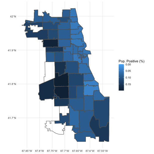<!-- --> ] .panel[.panel-name[Code] ```r ggplot() + geom_sf(data=dataset, aes(fill=percent_tested_positive_cumulative))+ scale_fill_continuous(trans = 'reverse')+ geom_sf(data=chi, colour="gray40", fill=NA)+ labs(fill="Pop. Positive (%)")+ theme_minimal() ``` ] ]] .pull-right[ .panelset[ .panel[.panel-name[Output] <!-- --> ] .panel[.panel-name[Code] ```r ggplot() + geom_sf(data=dataset, aes(fill=X_1st_dose_percent_population))+ scale_fill_continuous(trans = 'reverse')+ geom_sf(data=chi, colour="gray40", fill=NA)+ labs(fill="Pop. Vaccinated (%)")+ theme_minimal() ``` ] ] ] --- name: Maps2 class: top, left .pull-left[ .panelset[ .panel[.panel-name[Output] 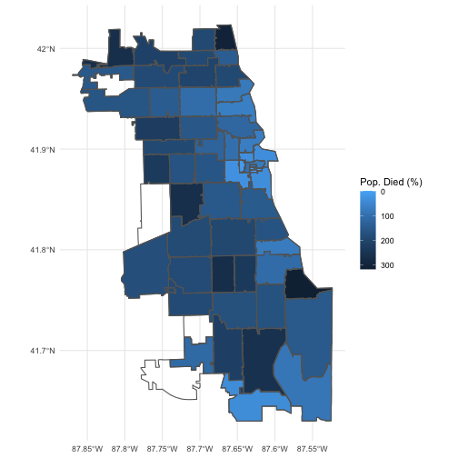<!-- --> ] .panel[.panel-name[Code] ```r ggplot() + geom_sf(data=dataset, aes(fill=death_rate_cumulative))+ scale_fill_continuous(trans = 'reverse')+ geom_sf(data=chi, colour="gray40", fill=NA)+ labs(fill="Pop. Died (%)")+ theme_minimal() ``` ] ]] .pull-right[ .panelset[ .panel[.panel-name[Output] <!-- --> ] .panel[.panel-name[Code] ```r ggplot() + geom_sf(data=dataset, aes(fill=X_1st_dose_percent_population))+ scale_fill_continuous(trans = 'reverse')+ geom_sf(data=chi, colour="gray40", fill=NA)+ labs(fill="Pop. Vaccinated (%)")+ theme_minimal() ``` ] ] ] --- name: What Next? class: bottom, left background-image: url(images/kelly-sikkema-cXkrqY2wFyc-unsplash.jpg) background-size: cover ### .salt[What Next?] .font-35[ What are the types of things you would want to <br>explore to understand what's going on here? Where might the information come from? ] --- class: middle .font-35[With <span style='color: #FDC87A;'>Data</span> , <span style='color: #50A781;'>Aesthetics</span>, and <span style='color: #568DC1;'>Geometry</span>, you can make a plot - in this week's lab you'll learn how to start layering plot elements together and take an iterative approach to refining plots.] --- name: Next Class class: top, left # Thursday's Class .font-35[On Thursday, we'll continue working on our manipulation of basic data visualizations]